Night Shift on Creating a Brand for The Atelier
When you think of branding, what do you think of? For most, that answer is likely aesthetics: logo, colours and fonts. And that’s fair because branding does involve those things. However, a solid brand should be so much more than that.
For Night Shift, a brand, at the root, is an emotion; a story that reveals and evolves over time. It’s several components when used thoughtfully together, illustrate a feeling and convey a larger message. And that feeling is something we strive for in every brand we create, and The Atelier was no different.
Background
We partnered with The Atelier to create their brand identity and design and build their website. The original direction for this identity was conceived in early 2018, but what started as a single conference has turned into something much larger, and the brand has had to evolve with it. We are going walk through a few of the components that make up The Atelier as a whole.
Brand Pillars
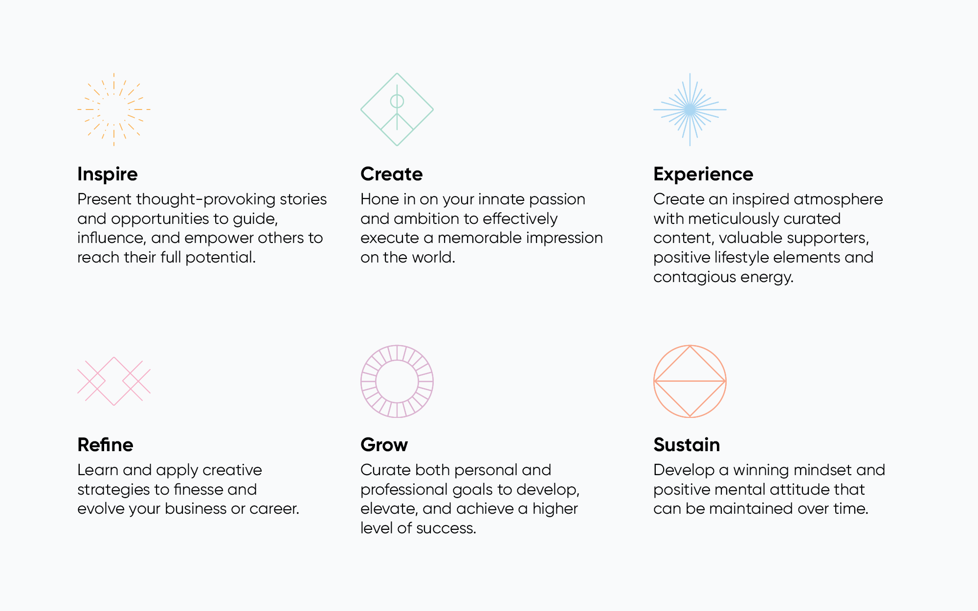
One of the most integral aspects of The Atelier are the brand pillars. We wanted to create a system that was strongly supported by its values, and is proud to wear them on its sleeve. The brand pillars are the mission, values, purpose and positioning that help support the structure of your brand. They provide a strong connection to your customer base and help differentiate your brand from your competitors. Your pillars become your compass—the lens through which you evaluate all decisions within your organization.
Brand Mark
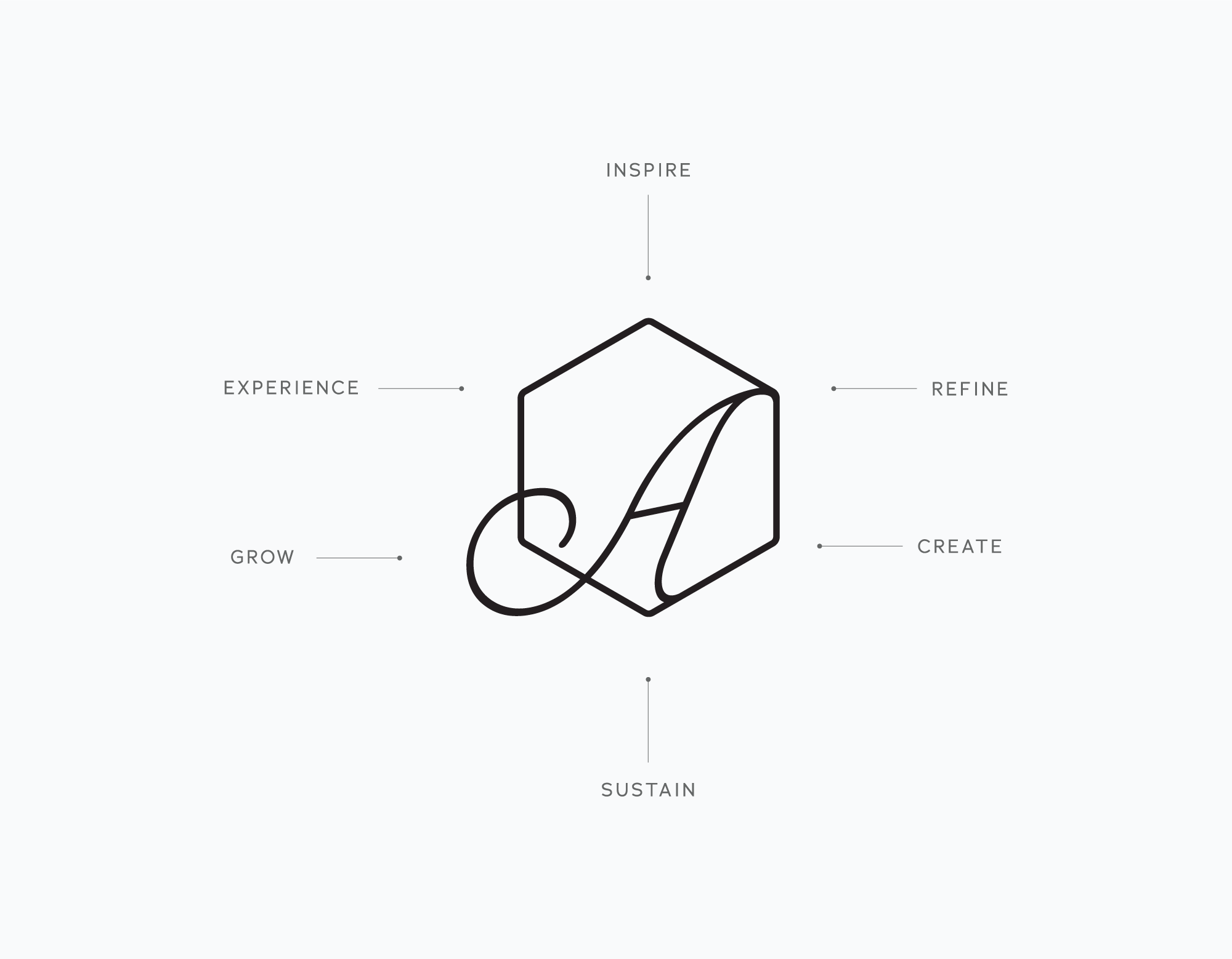
These pillars come together to form the brand mark for The Atelier – The six points that come together to house the ‘A’, representing The Atelier collective as a whole.
Brand Voice
A brand voice is often overlooked in brand building because so much is weighted on the visuals. However, we would argue that the voice of your company is equally as important. The voice considers how the brand should sound to its audience. It is the unique personality of your brand and it has to match the direction of the visuals. There needs to be consistency. Think of it as a person at a workshop, who would it be? Keeping it human and maintaining consistency across all mediums will communicate authenticity.
Genuinity
The Atelier voice is human. It’s relatable, approachable and honest. The priority is keeping it real while avoiding aloof corporate language and phony marketing jargon. Ackkk–
Purposeful
The Atelier exists to empower and inspire. It’s welcoming and encouraging. Each decision is deliberate and thoughtful, leaving the reader to feel considered.
Energetic
The Atelier is driven by passion. Language is positive and upbeat so that readers feel motivated and enthusiastic. There is a spirit behind the communication, bringing it to life.
The Atelier voice is:
- Sophisticated but not stuffy
- Empowering but not overbearing
- Elegant but not aloof
- Smart but not an expert
- Inspiring but not cheesy
- Encouraging but not condescending
Brand Hierarchy
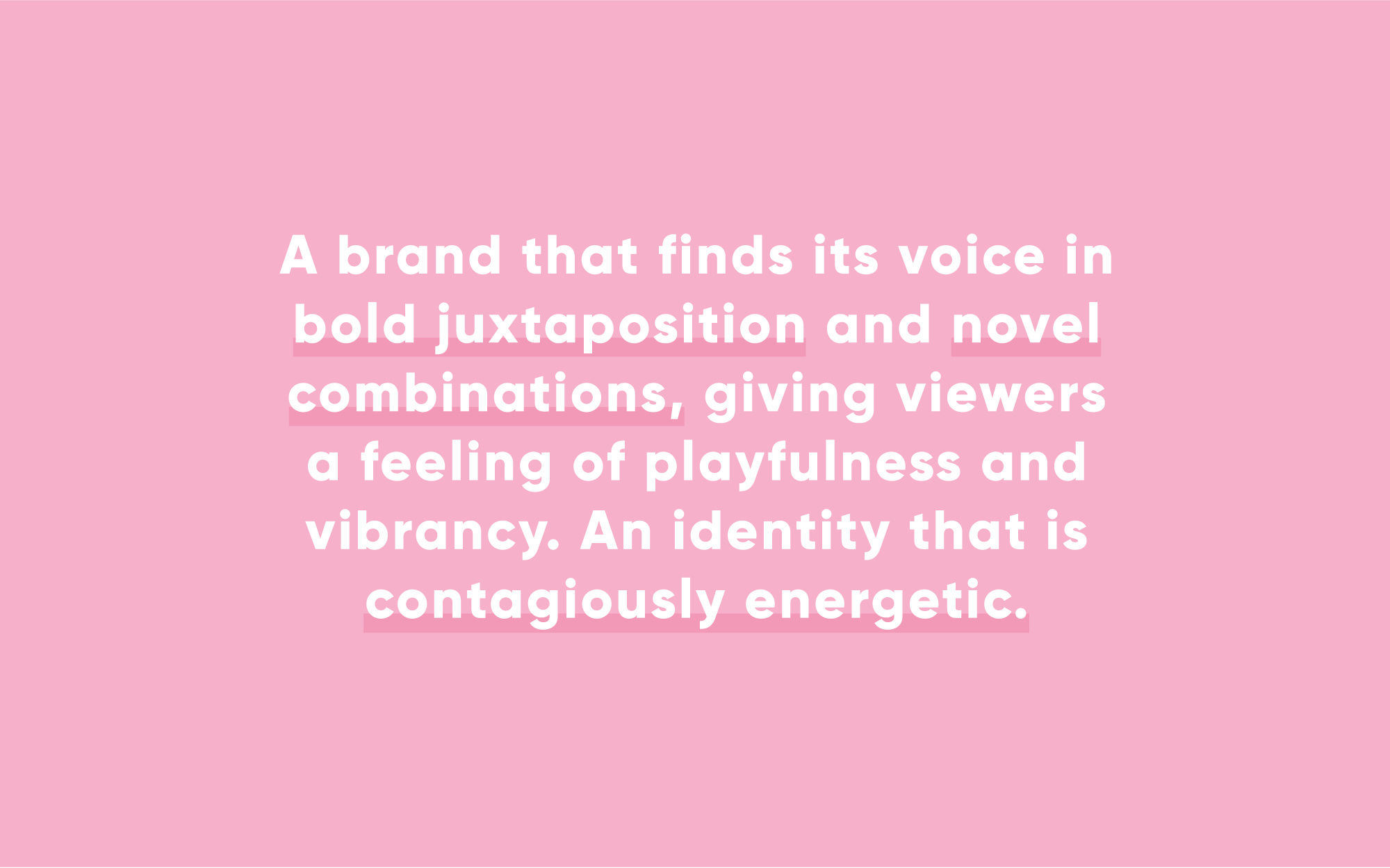
Part of the growth of The Atelier brand is the evolution from a single event to a larger, growing collective. We helped create a system that encompasses these new facets of the brand, introducing typographic & colour systems that help create a mosaic from The Atelier’s endeavors. The Atelier Collective is the umbrella – the unifying organizational brand, housing Signature Events and Atelier Workshops as entities that both standalone as singular products, but feel comfortably at home with one another. One of the challenges was developing a systematic approach, that will help expand the brand voice of The Atelier for future products. The result was a dramatic new approach to colour and typography that brings a fresh, new voice to the brand.

The Signature Event
In order to maintain the brand hierarchy, we needed a way to visually separate the core business offerings of The Atelier so each had their own unique presence and could stand confidently alone or cohesively together.
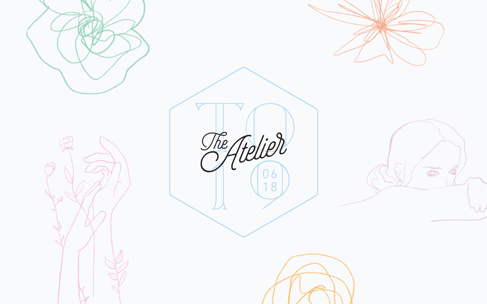
This year, for the 2019 Toronto Conference, we introduced the visual concept of growth. We brought together the elegant Art Nouveau curves of the Atelier’s logo with softer, human illustrations that compliment the linework in playful, unexptected ways. The honeycomb has been reinterpreted as an element for the signature event, marrying the existing structures of the brand with a new typographic expression.
Photography
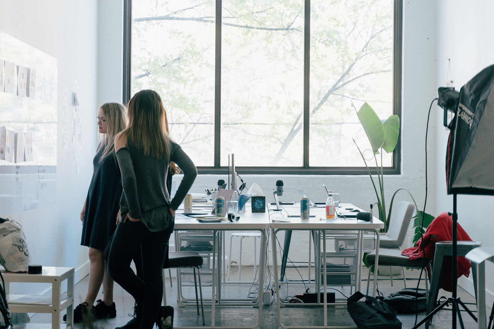
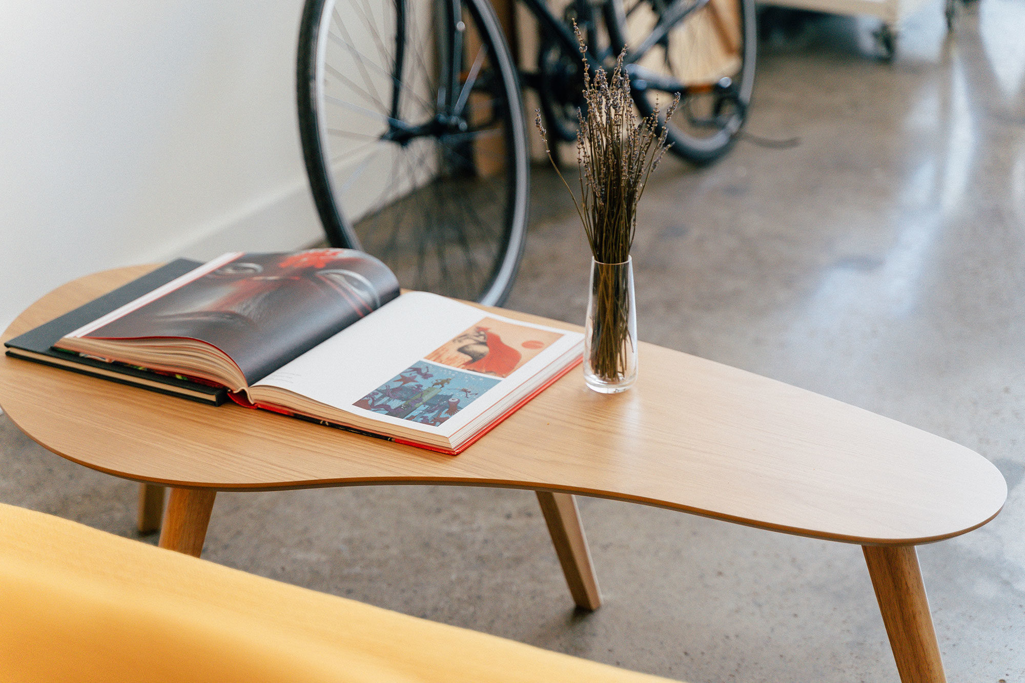
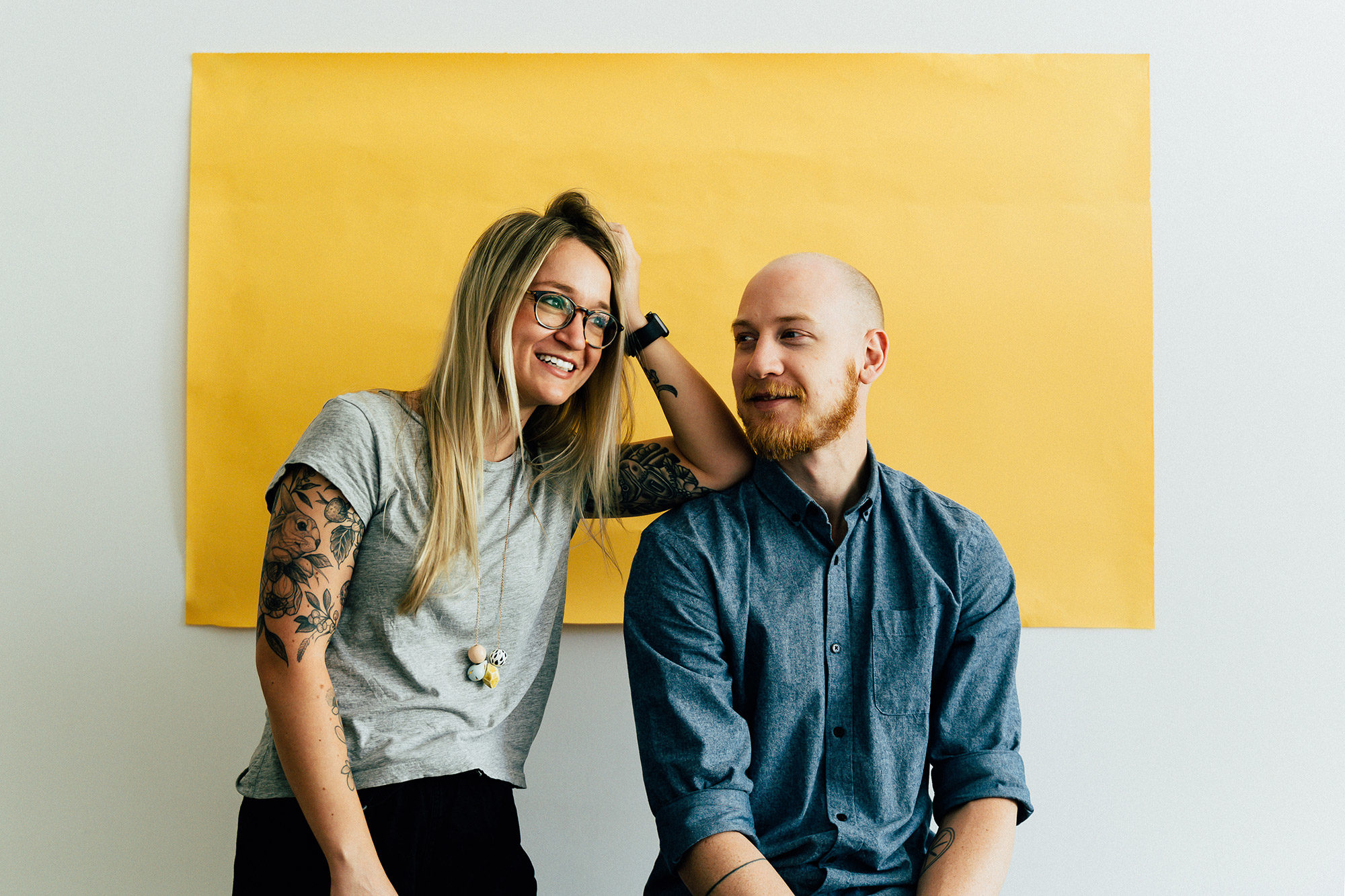
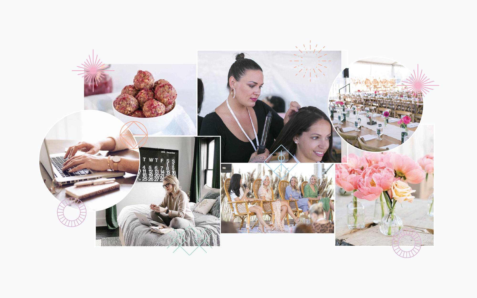
Though the graphics system and colours are fundamental expressions of the brand, photography is integral to how people see and experience The Atelier as a whole. We felt it was imperative to use photography that avoids the stereotypical ‘business/entrepreneur’ type photos. We wanted to use a photography style that embraced natural light, graceful moodiness and an overall natural vibrancy that reflects a well-designed lifestyle.
About Night Shift
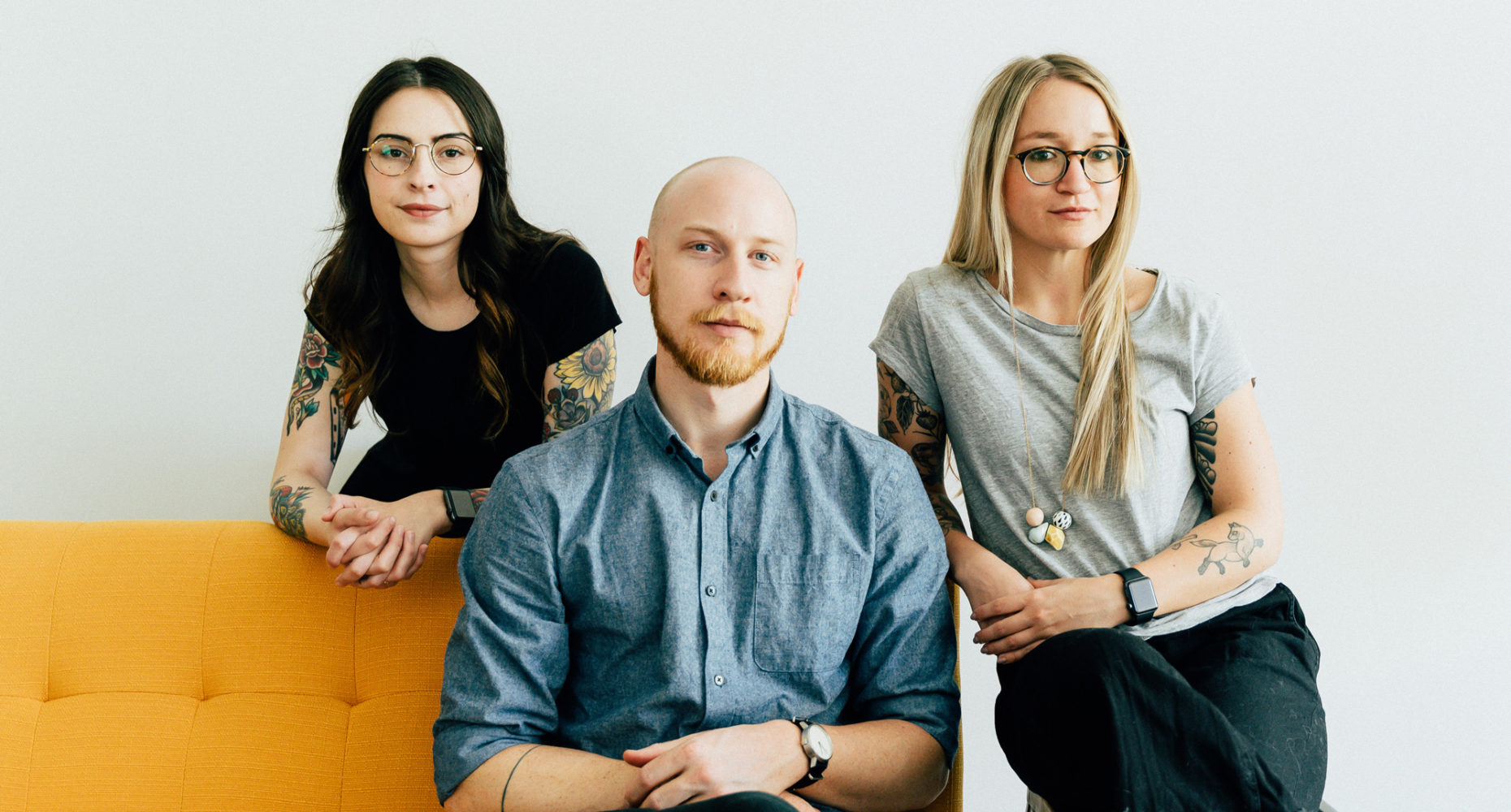
Night Shift is a design studio run by Natasha McDiarmid and Sam Johnstone. We work with businesses that care about their audiences and care about craft. We work carefully and thoughtfully, and believe that a good brand is a barometer for good value. If you do too, give us a shout. We’d love to hear from you.

